How Does a Brand's Website Become Part of Its Visual Identity?
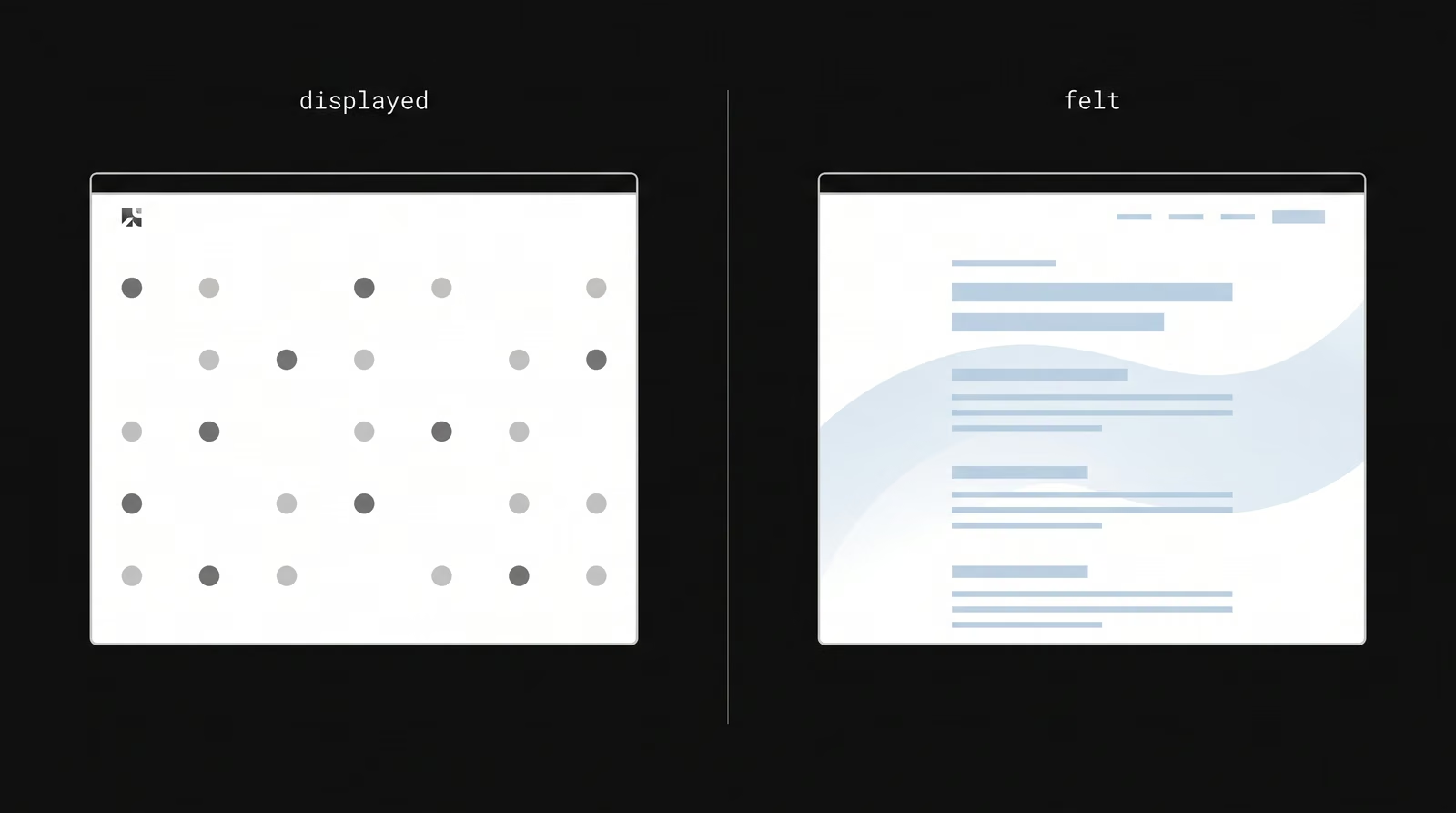
A website becomes part of a brand's identity when, instead of merely displaying it, it makes the brand felt through typography, color, motion and layout. Putting the logo in a corner and using brand colors does not make a site branded; what makes the brand felt is the rhythm, tone and character a visitor meets while moving through the page. The numbers show this is not a detail: color alone can raise brand recognition by up to 80% versus monochrome (University of Loyola Maryland research) — and the website is where those visual signals are experienced most densely. The site becomes an extension of the identity when it speaks the same language as the brand's other channels.
How is brand identity carried into a website?
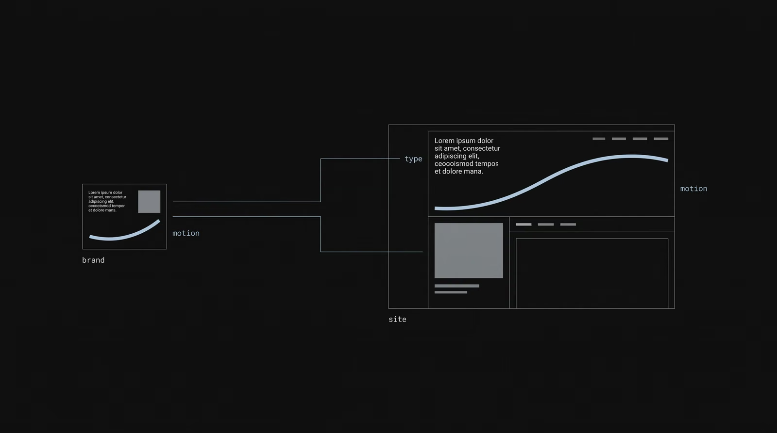
Brand identity is carried into a website by translating not only static elements but also interactive behavior. Color, typography and logo transfer directly; but the real transfer is turning tone into motion, whitespace and transitions. A calm brand wants soft transitions and generous whitespace; an energetic brand wants a faster, denser rhythm. There is a critical fact here: although roughly 95% of brands have guidelines, only 25–30% enforce them consistently — and the web is where that gap is most visible, because every button and transition on the site is a brand decision. The identity becomes visible in how the site behaves.
How do web design and brand identity work together?
Web design and brand identity work together as one applies the other. Brand identity sets the rules (color, typography, tone); web design places those rules into the context of screen, interaction and content. Thought about separately, you get either a beautiful site with no brand or a branded site that is not beautiful; thought about together, the site both works and feels like it belongs to the brand. Gartner's 2020 finding confirms the opposite case: 60% of marketers say inconsistent presentation lowers performance — and a disjointed site is exactly that inconsistency on screen.
What makes a website specific to a brand?
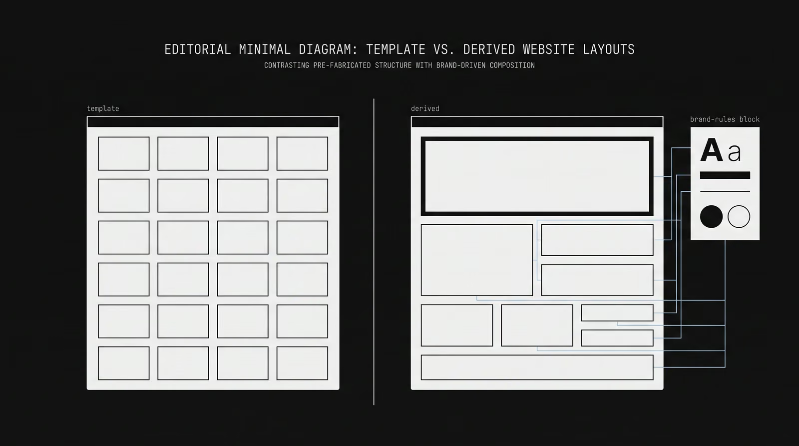
What makes a site specific to a brand is consistency in the details that cannot be copied. Custom typography choices, a color logic that belongs to the brand, a repeating layout rhythm and micro-interactions that match the tone lift a site out of the template look. When these details add up, a visitor feels which brand they are on before seeing its name. Apple's product pages are a school for this: the same whitespace logic, the same typographic hierarchy and the same transition rhythm say "this is Apple" before the name appears.
Why does typography matter in web design?
Typography matters in web design because most of a site's content is text, and the typeface is the brand's voice. Good typography carries both readability and character: a clear hierarchy between heading, body and labels makes content scannable, while the chosen type family sets the brand's tone. Weak typography makes even the best design look generic. Like color, typography's power is in its repetition — using the same type family consistently across every page makes the site part of the same brand as its social and ad content.
How does motion affect a website's brand perception?
Motion directly affects perception by making the brand's character felt. How an element appears, and the speed and softness of transitions, wordlessly say whether the brand is calm or energetic, serious or playful. Purposeless animation distracts and often slows the site down; purposeful motion makes the brand feel alive and memorable. The measure is whether the motion serves the brand and does not harm page speed — because a slow "flashy" site loses both the visitor and the search engine.
What is the difference between a creative website and a standard corporate website?
The difference lies in how the site expresses the brand. A standard corporate site places content into a ready-made structure; it does the job but carries no character. A creative site derives its layout, typography and motion from the brand's own language. The second does not just deliver information — it leaves an impression, and that impression is often the first point of contact. Research tying consistency to revenue (up to 33% in the Lucidpress studies) explains why this difference matters: a site with character and consistency lets the brand compound with every visit.
How do you create visual hierarchy on a website?
Visual hierarchy is created by using size, color, contrast and whitespace to guide the eye to the most important element first. On every screen a single primary element stands out; secondary information is positioned relative to it. Good hierarchy shows visitors what to read and what to do next without making them think; without hierarchy, everything shouts at once and nothing is heard. This is the web version of the "single central idea" principle: the more a screen tries to say, the less it conveys.
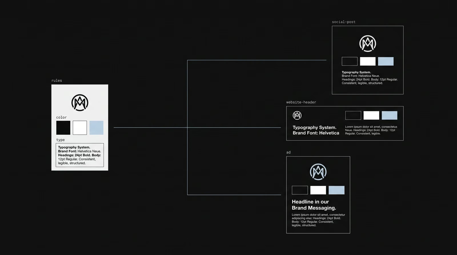
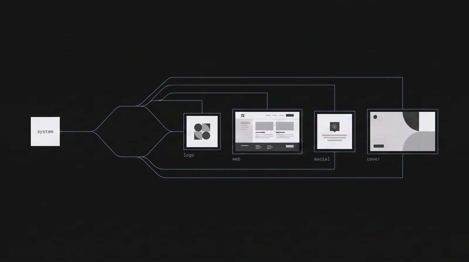
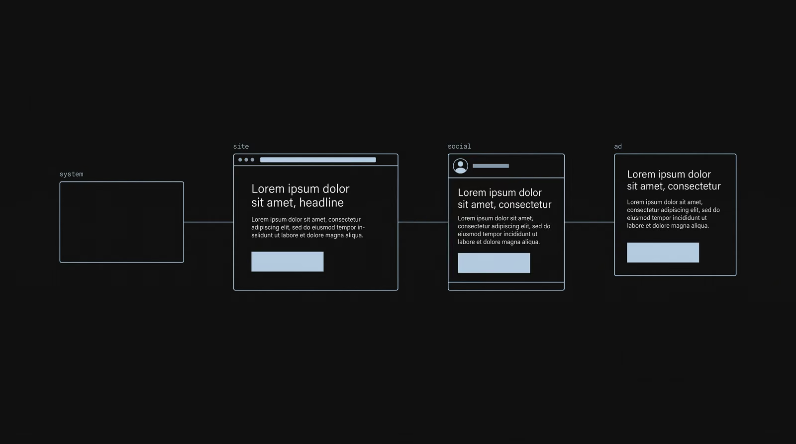
How does a brand's website stay consistent with social media and other channels?
A website stays consistent with other channels when they are all fed by the same visual system. The color, typography and visual language used on the site must come from the same source as the social and ad visuals. That way, a user who sees the brand in an ad and lands on the site feels no break; they feel like they are moving through different rooms of the same brand. This is also why teams using a design system finish work 34% faster (Superside, 2026): when the site and the social visual both derive from one system, each new piece comes from the rules rather than from scratch.