What Is Visual Consistency, and Why Does It Matter?
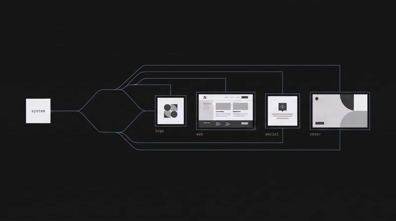
Visual consistency is the repeated use of the same logo, color, typography and visual language everywhere a brand appears, so it looks like one brand across every channel. It is not one beautiful design — it is the same design logic showing up again and again, from a social post to a website to an ad. According to Lucidpress (now Marq) research, consistent brand presentation can lift revenue by up to 33%.
Visual consistency is the repeated use of the same logo, color, typography and visual language everywhere a brand appears, so it looks like one brand across every channel. It is not one beautiful design — it is the same design logic showing up again and again, from a social post to a website to an ad. The payoff is measurable: according to Lucidpress's (now Marq) State of Brand Consistency study of more than 400 brand managers, consistent brand presentation can lift revenue by up to 33%. Consistency is what turns scattered outputs into a brand people recognize before they read a word.
What is visual consistency, exactly?
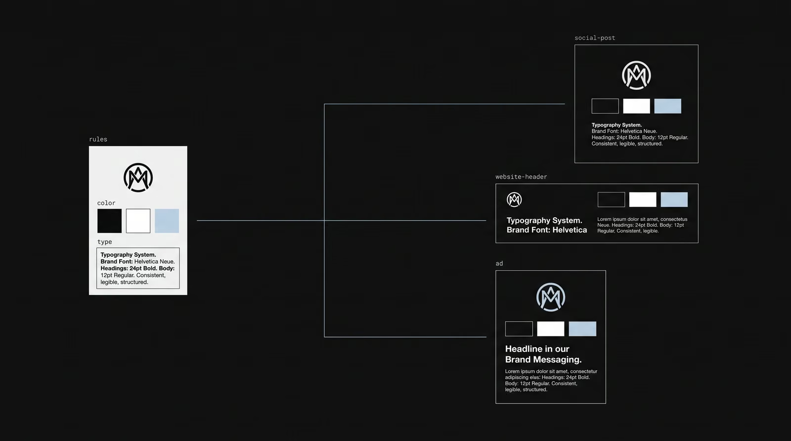
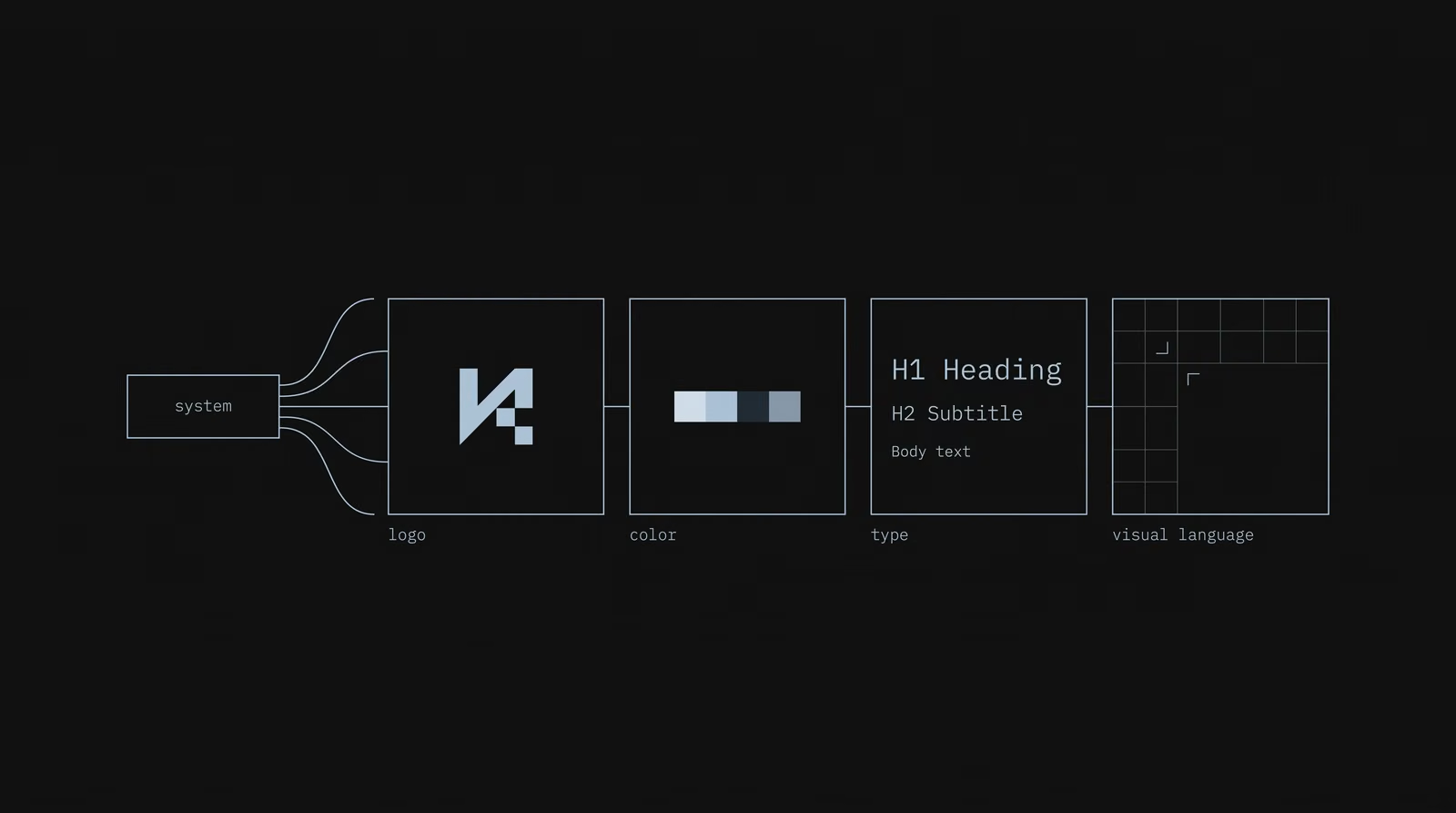
Visual consistency means every touchpoint is built from the same fixed set of visual rules. Those rules cover four elements: the logo, the color palette, typography and the visual language (photography style, graphics, grid and whitespace). When each new asset is derived from the same rules instead of designed from scratch, the pieces feel related even when they are different. The test is simple: cover the logo, and the audience should still know whose content it is.
Why does visual consistency matter for brands?
Visual consistency matters because recognition is built through repetition, and that repetition ties directly to revenue. In the Lucidpress study, 68% of companies said brand consistency contributed 10–20% to revenue growth, and in Gartner's 2020 benchmark, 60% of marketers reported that inconsistent messaging hurt performance. An inconsistent brand reintroduces itself at every touchpoint; a consistent brand compounds with every post. Over time that compounding lowers the cost of attention — reaching something familiar is cheaper than buying recognition from scratch each time.
What is the difference between visual consistency and brand consistency?
Visual consistency is what you can see; brand consistency is the whole experience behaving the same way. Brand consistency also covers tone of voice, messaging, values and how the brand acts at every step. Visual consistency is the part of that — the logo, color, type and imagery — that a person recognizes instantly. The two work together: a brand can sound consistent but look scattered, or look consistent but say different things in different places. Visual consistency is the fastest, most immediate signal of the larger promise.
How do you keep a brand visually consistent across social media?
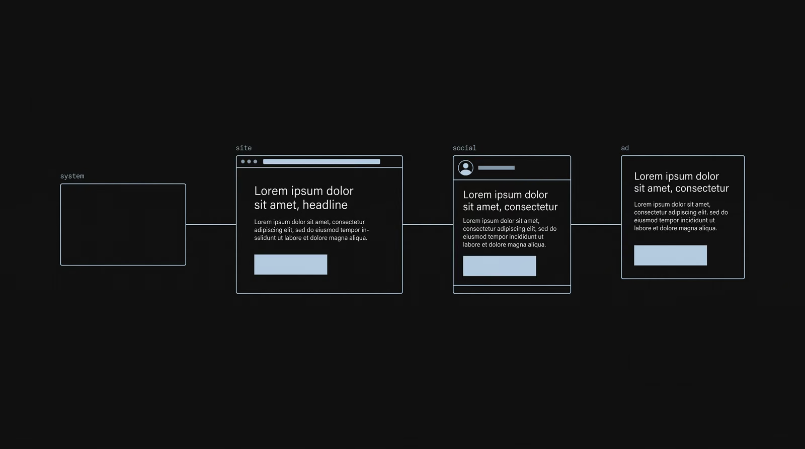
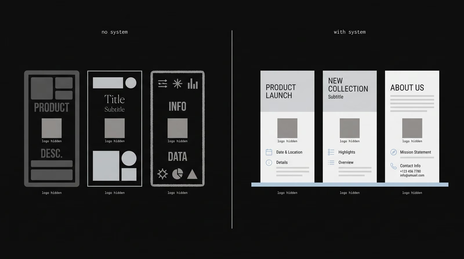
A brand stays consistent across social when every platform pulls from the same visual system rather than being designed separately. Instagram, LinkedIn, TikTok and stories all use the same palette, type families, logo versions and photography style; only the format changes, not the rules. The practical tool is templates: teams that work from a design system complete assets about 34% faster (Superside, 2026), because each new post is derived from existing rules instead of started from zero. Speed and consistency come from the same place — a system, not one-off design.
Why do AI-generated visuals break brand consistency?
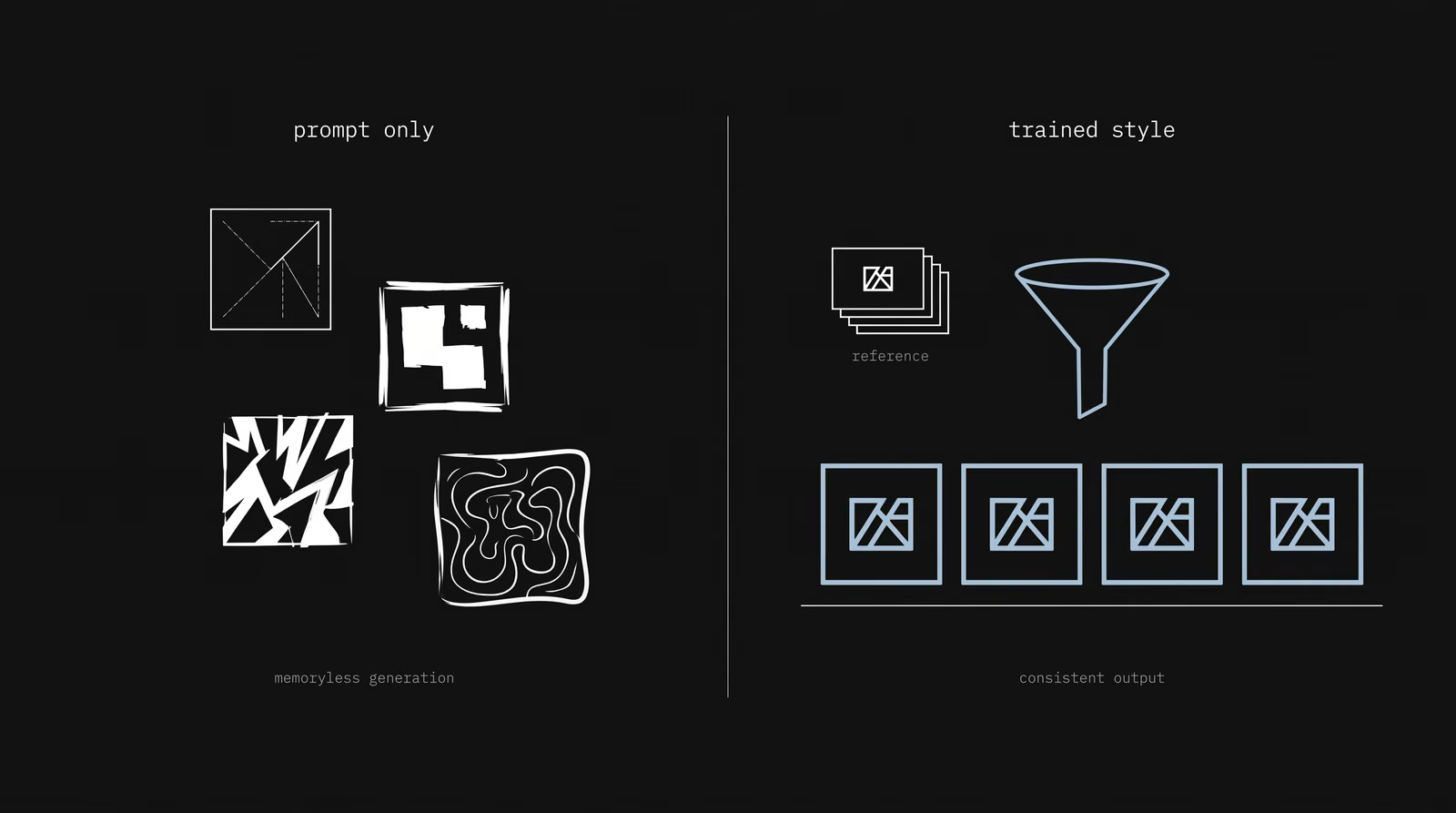
AI-generated visuals break consistency because each image is produced independently, so style, color and framing drift from one output to the next. This is not a small annoyance: in Adobe's 2025 survey of 1,200 creative professionals, character and style consistency was named the number-one barrier to adopting AI in professional work. Writing a longer prompt and hoping for a match does not fix it, because the model has no memory of your brand between generations. The problem is structural, which means the fix has to be structural too.
How do you keep AI-generated images consistent with your brand?
You keep AI images on-brand by giving the model a fixed reference to work from instead of relying on prompts alone. For lower volume, reference images and locked style settings hold a look together across a set. For higher volume, a small style model trained on your own brand images (a LoRA) reproduces your style repeatedly — one creator trained a brand-style model on 25 images in about 30 minutes and then generated hundreds of on-brand visuals from it. A useful rule of thumb: under about 50 images a month, reference images are enough; above that, training a style model pays off. AI consistency is an identity system, not a prompt trick.
How is visual consistency different for fashion and beauty brands?
For fashion and beauty brands the core elements are the same, but the visual language carries most of the weight. Because the product is largely visual, the photography style — lighting, crop, color grade, model direction and set — becomes the thing customers recognize before the logo appears. A campaign shot, a product page and a Reel should share the same treatment so they read as one brand at a glance. Here color and photography are the most rigidly fixed layers, because in these categories the “feel” of the image is the brand.
How do you build a repeatable visual system?
A visual system is built with rules first, not with individual designs. The sequence is: clarify the brand personality, define the core elements (logo, color, typography, visual language), write their usage rules with exact values, then derive templates from those rules. But here is the fact most brands skip: having a guideline is not the same as being consistent. Research shows roughly 95% of companies have brand guidelines, yet only about 25–30% enforce them consistently, and more than 77% still struggle with off-brand content. The goal is not a PDF but a framework the brand produces from — one where every output is checked against the rules before it ships.
Visual consistency checklist
Use this as a fast check before any asset goes out — each item should already be answered by the system, not decided in the moment:
- Logo: correct version for the format (mark vs full logotype), with room to breathe, legible at small sizes.
- Color: exact palette only, same HEX everywhere; no invented tints per design.
- Typography: fixed type families and hierarchy for headings and body.
- Visual language: consistent photography style, crop and color grade.
- Layout: shared grid and whitespace rules across channels.
- Channels: social, website and ads all derived from the same templates.
- AI content: generated from reference images or a trained style model, then checked against the same rules.