How Does a Brand's Visual Identity Become a Consistent System?
A brand's visual identity becomes a consistent system when it is tied to repeatable rules rather than one-off designs. Those rules define where and how the logo, color, typography and visual language are used, so the brand feels the same on every channel — and according to Lucidpress (now Marq) research, consistent brand presentation can lift revenue by up to 33%.
A brand's visual identity becomes a consistent system when it is tied to repeatable rules rather than one-off designs. Those rules define where and how the logo, color, typography and visual language are used, so the brand feels the same on every channel. This is not an aesthetic luxury, and the numbers back it up: according to Lucidpress's (now Marq) State of Brand Consistency study of more than 400 brand managers, consistent brand presentation can lift revenue by up to 33%. Consistency does not come from one beautiful design — it comes from repeating that design's logic everywhere.
What is the difference between brand identity and visual identity?
Brand identity is the brand's whole personality; visual identity is the part of it you can see. Brand identity also covers abstract elements like tone of voice, values and positioning. Visual identity is those elements turned into logo, color, typography and visual language. The two are inseparable: visual identity is the outward face of brand identity. This distinction has a practical payoff — you can refresh a visual language without repositioning the brand, but if you build the visuals detached from the identity, the brand looks “pretty but foreign.”
Which visual elements make up a brand identity?
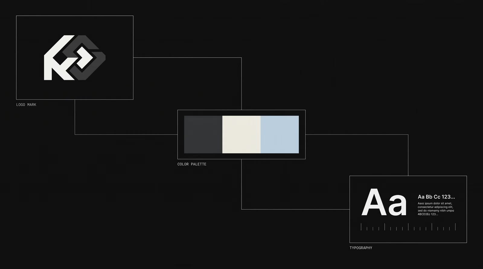
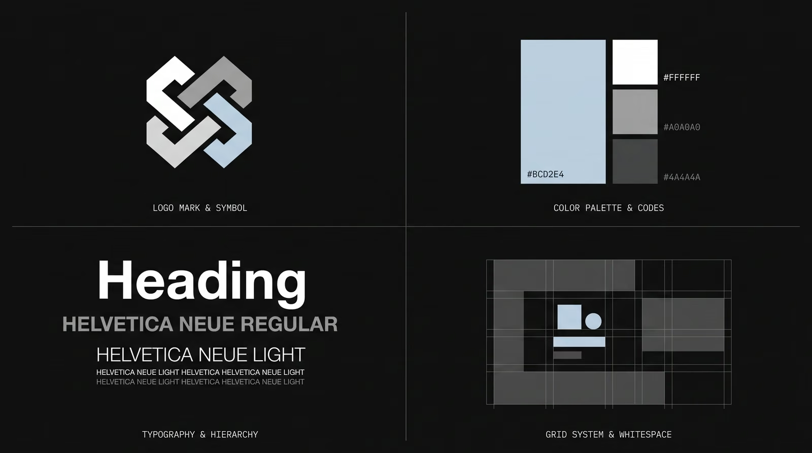
A visual identity is built from four core elements: the logo, the color palette, typography and visual language. The logo is the brand's signature; the palette defines primary, secondary and neutral tones with HEX and CMYK values. Do not underestimate color: the widely cited University of Loyola Maryland research found that color can raise brand recognition by up to 80% compared with monochrome — and the crucial nuance is “up to, versus monochrome,” not “always 80%.” In other words, the real gain comes from consistent use of color, not from a single color. Typography sets the type families and hierarchy for headings and body; visual language covers photography style, graphic elements, grid and whitespace — the layer that actually holds the system together.
Why does brand consistency matter?
Brand consistency matters because recognition is built through repetition, and that repetition ties directly to revenue. In the Lucidpress study, 68% of companies said brand consistency contributed 10–20% to revenue growth; in Gartner's 2020 benchmark, 60% of marketers reported that inconsistent messaging hurt performance. An inconsistent brand has to reintroduce itself at every touchpoint; a consistent brand compounds with every post. Over time that compounding reduces dependence on ad spend — because reaching something familiar is cheaper than buying attention from scratch each time.
How should a logo be used across different platforms?
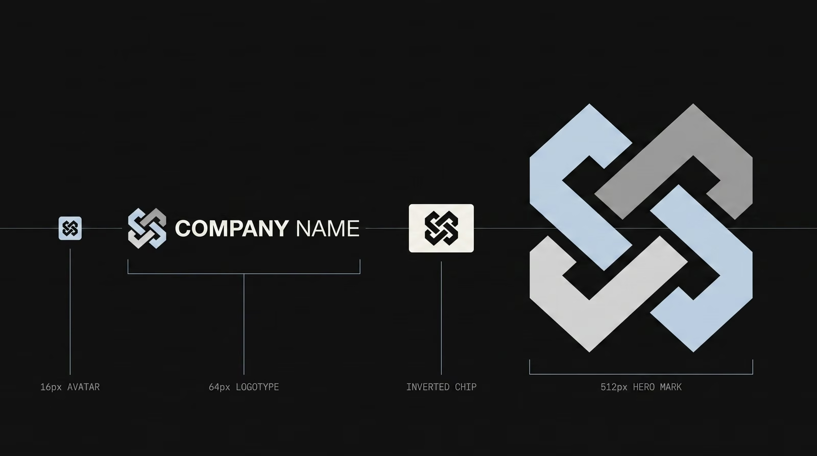
A logo should be used through several ready-made versions that fit each platform's size and context. A compact mark for square avatars, the full logotype for horizontal spaces, and separate color versions for dark and light backgrounds. Apple is the clearest example: from hardware to software, from store signage to app icon, the same mark is defined to stay legible at every scale. The governing rule is that the logo must be readable everywhere and given room to breathe; a logo that falls apart when shrunk signals a weak system from the start.
How do typography and colors affect brand consistency?
Typography and color are the fastest signals that let a brand be recognized before a word is read. A fixed palette and a limited set of type families create a visual link between different pieces of content. If color and typography change with every design, the brand reads as scattered even when individual pieces look good. The real question is not “which color” but “the same color everywhere” — because what produces recognition is not the color itself but its repetition. That is why both are the most rigidly fixed elements of the system.
How can social, website and ad visuals carry the same brand language?
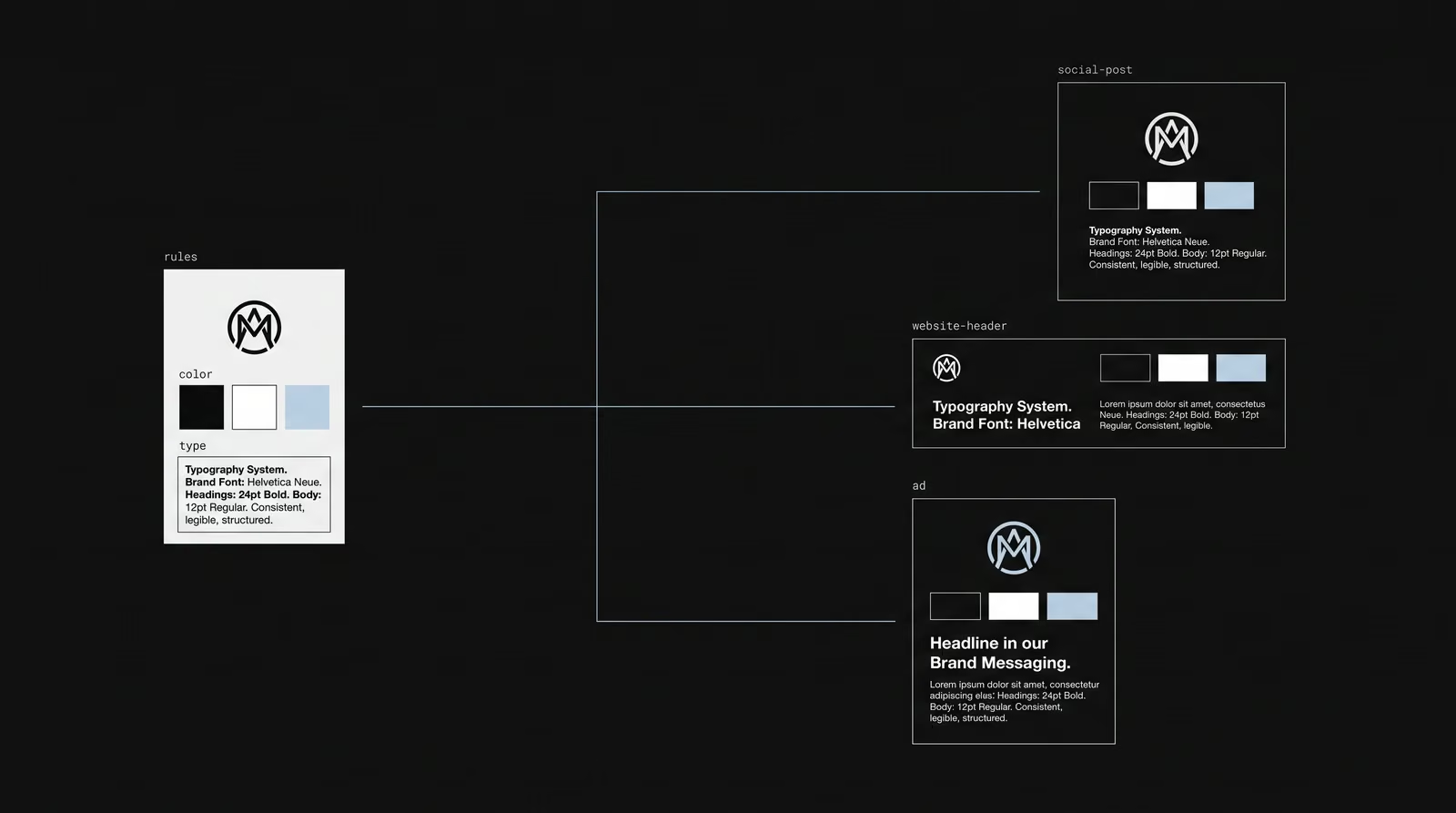
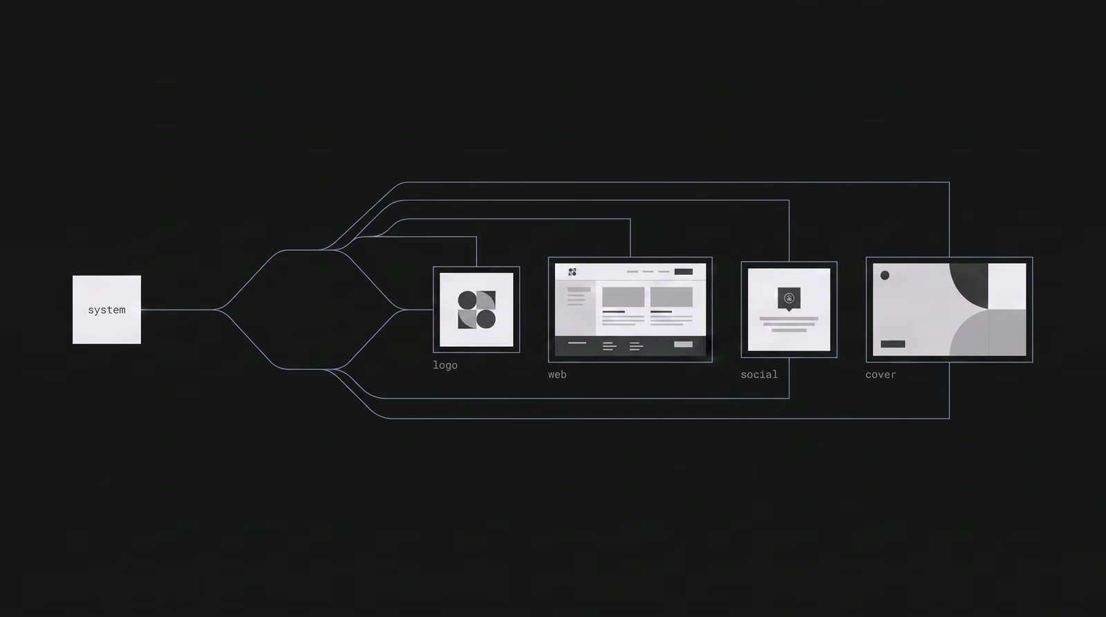
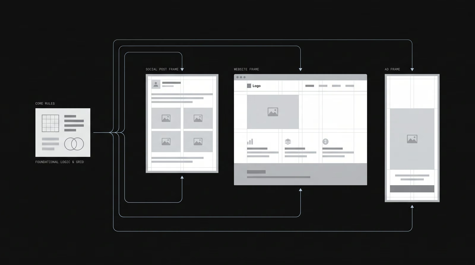
Different channels carry the same brand language when they are all derived from a single visual system. Social, web and ad visuals are not designed separately; they are produced from templates fed by shared color, typography, grid and photography style. The channel changes but the rules do not, so a user recognizes the brand as the same brand on Instagram, on the site and in an ad. Templating also brings speed: teams using a design system complete work about 34% faster (Superside, 2026), because each new asset is derived from existing rules rather than started from zero.
How do you build a visual system for a brand?
A visual system is built first with rules, not with individual designs. The sequence is: clarify the brand personality, define the core elements (logo, color, typography, visual language), write their usage rules, then derive templates from those rules. But here is the fact most competitors skip: having a guideline is not the same as being consistent. Research shows roughly 95% of companies have brand guidelines, yet only 25–30% enforce them consistently, and more than 77% struggle with off-brand content. The result should not be a pile of files but a framework the brand can produce from on its own — one where every output is checked against the rules.
How does a visual identity scale as a brand grows?
A visual identity scales with growth when it is built as a flexible but bounded system. As new products, channels and languages are added, the system should allow new parts to be derived from the same core rules. Large systems like Google Material Design, IBM Carbon and Shopify Polaris do exactly this: even components built by third parties must obey the same language, so the brand does not fall apart under hundreds of different hands. A well-built system does not break under new demands — it extends; each new part is added to the existing language without disrupting it.